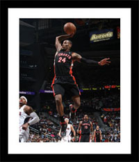
Welcome back to NBA247365.COM’s countdown of the top 20 NBA uniforms of all-time! We’ve reached the top five, but those who missed out on earlier stages of the list can go back and check out numbers 20-16, 15-11, and 10-6. Now, here are the best of the best…
#5: Los Angeles Lakers (1966-now)**
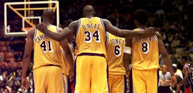
The Celtics have won more titles, but the Lakers are arguably the most successful franchise in NBA history. From George Mikan to Dwight Howard, it seems that they’re always able to draw the league’s premier talents, and since 1966 those talents have been wearing the same purple & gold (and white on Sundays since ’01). It’s a color scheme fit for NBA royalty, which is exactly what the Lakers are.
#4: New York/New Jersey Nets (1976-1990)**
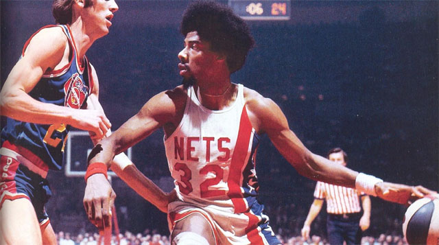
Together, Julius Erving and the ABA pioneered a fresh brand of exciting basketball. In addition to the three-point line, one of the best things they brought to the NBA via the 1976 merger was the uniform of the Nets. The look remained current all the way through the ’89/90 season, and it was brought back periodically throughout 2012 as part of the Hardwood Classics program. Even Kris Humphries looked relatively cool in this uniform, demonstrating its true aesthetic greatness.
#3: Chicago Bulls (1995-1997)***
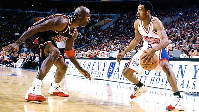
The uniform I’m referring to here is the black alternate with the pinstripes. You know, the one that coincided with the first comeback, the Concord XIs, Space Jam, and the team that went 72-10. Considering all that happened during the specific two-year period that this style covered, the fact that it did last just two years kind of adds to its legend. The Bulls’ regular home and road unis have always been nice in their own right, but this alternate was fire.
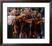
#2: San Francisco Warriors (c. 1970)**
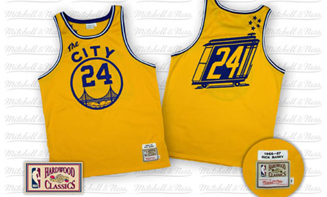
With the Golden Gate on the front and a trolley car on the back, I’d argue that no uniform in the history of sports has been more effective in representing its city, and this creative graphic rendering of San Francisco resulted in what I consider the coolest jersey of all-time. Delving beyond the obvious, there are so many unique aspects of the design to appreciate. For example, consider the diagonal alignment of the number on the back, or the the combination of two different fonts on the front.
Never have I seen, and never do I expect to see another uniform quite like this one. As far as creativity, “The City” takes the cake.
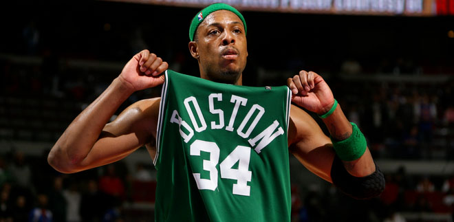
#1: Boston Celtics (1946-now)**
Off the top of my head, I can’t rattle off the dictionary definition of “classic.” However, I feel like I can give you a pretty good idea of what the word means: if something was relevant over six decades ago and remains at the forefront in the present day (ESPN just ranked the Celtics’ uniforms #1 in the NBA), then it’s probably classic.
It’s not just the winning, sixty-plus-year history of the Celtics that makes their uniform great. Although simple, both the home and road versions are pleasant to look at. Personally, I like the fact that the Cs haven’t altered the shape of their jerseys; Paul Pierce wears the same standard tank top with the scoop-neck collar that Bill Russell wore as he won 11 titles in the ’50s and ’60s. This type of tradition is unmatched, and that’s why Boston earns the #1 spot.
*Denotes a personal favorite.
**Denotes an iconic uniform.
***Denotes a “player-made” style.


