Welcome back to NBA247365.COM’s countdown of the top 20 NBA uniforms of all-time! About a week ago, I got the list started by posting selections 20 through 16. If you missed it, click here before moving on to the next five.
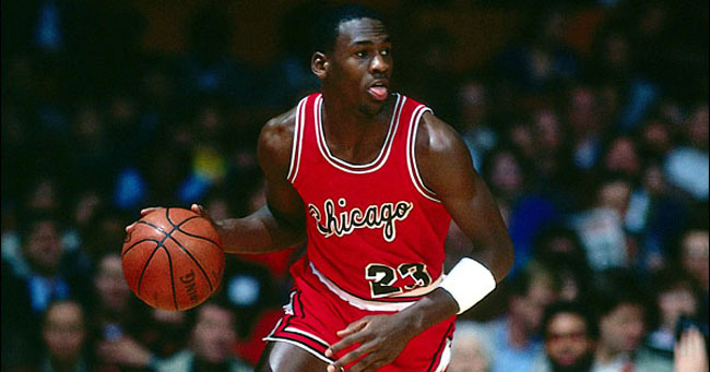
#15: Chicago Bulls (1973-1985)***
The pleasing aesthetics of black and red along with a gorgeous cursive font simply compliment the fact that Michael Jordan happened to rock this look during his inaugural NBA season. The Bulls decided to change things up just one year into MJ’s career, but still… this is the rookie card of MJ jerseys; and even if it wasn’t, it still would’ve looked nice.
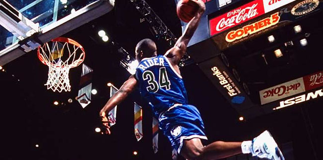
#14: Minnesota Timberwolves (1989-1996)*
With the exception of the ’94 dunk contest, there’s not much winning to speak of here. That being said, I still consider the Wolves’ original look a success. The font was angular and aggressive, but it was also bold and readable. The color scheme was unorthodox, but it worked. It wasn’t the Minnesota uniform that would become synonymous with the relatively-glorious Kevin Garnett era, but “Da Kid” did wear it when he was, well, a kid (the youngest player ever to have taken an NBA court, as a matter of fact). And there was that ’94 dunk contest, which featured J.R. Rider, the road blues, and the East Bay Funk Dunk.
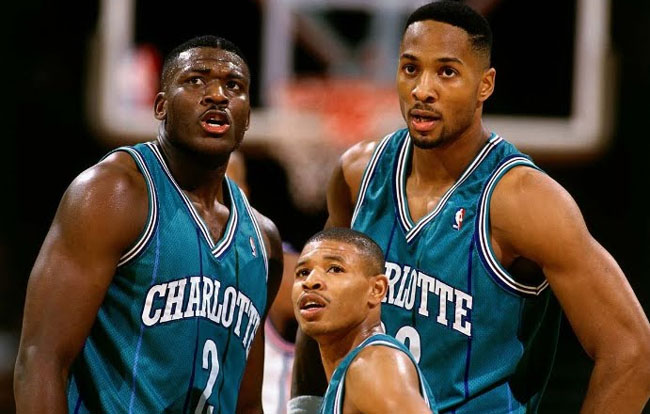
#13: Charlotte Hornets (1988-2002)*
You collect jerseys? You have a pinstriped L. Johnson joint. You may not have the white, the purple, and the teal… but you have at least one of the above. It’s pretty much requisite. In all seriousness, this was one of the illest color schemes ever to hit the hardwood. The home, the road, and the alternate were all fly as f@ck (I’ve yet to determine which is my absolute favorite, though I tend to lean towards the teal), and the fact that a man with the swag of Larry Johnson sported this uni only bolsters its classic standing.
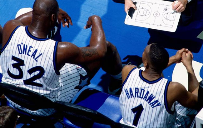
#12: Orlando Magic (1989-1998)*
While the pinstripe Magic jerseys were fire in their own right (always loved the font, the sparkling star in place of the “A”), it’s the shorts that I really like. Of all the uniforms to make this list, this one probably features my favorite trunks. The picture I chose doesn’t provide you with the best look, but you know how the trim follows the contour of the stars on each side? I think that little design cue sets them off.
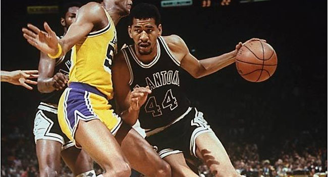
#11: San Antonio Spurs (1976-1982)*
As they have throughout Duncan’s championship dynasty, San Antonio’s home whites featured the spur on the bottom of the “U.” The look was carried over from the ABA, which is really cool (I’m failing to come up with any other ABA uniform that maintains any semblance of life in 2012). As for the road jerseys… those have long been gone, but they were black and white (and a touch of silver) done right. “Clean” is the adjective that comes to mind. Maybe “smooth,” too… kinda like Ice Man’s finger roll.
*Denotes a personal favorite.
**Denotes an iconic uniform.
***Denotes a “player-made” style.

